My mom retired from 32 years of education in June 2024, and this project is a small tribute to her career. It is hard to describe the impact she has had on me personally – after all, she was my first “teacher” in the early years, and I have both my parents to thank for igniting a visual and musical art passion. Nonetheless, the words below are a non-fictional chronology that shed light on this project’s meaning. (If you prefer more of a free verse tribute, visit my sister’s blog.)
This blog was quite nostalgic to put together. Some of the graphics were extracted from an external hard drive collecting dust in my old room at the parent’s house. In a sense, it is a story of my own educational journey that led me to a cherished career building web software.
The First Website
I can still remember the summer my mom secured a Microsoft FrontPage license for use on our home desktop computer. Through limited computer lab sessions, I had managed to publish my first website, and I was eager to iterate on the project more frequently. I had become fascinated by using the web as a medium for graphic design. There was something special about curating digital art in an interactive format that could be shared with anyone through a web browser.
The site showcased a hand-drawn “superstar”, outlined with a bright yellow glow. Three quirky fonts in the heading alone were elevated by an unnatural amount of drop shadow. In the center of the page, seven smaller stars adorned Comic Sans navigation links, each glowing with a color from the rainbow. And a crayon-themed hit counter in the footer catered to the times. In an era before dominating education content management systems, the project served as a digital resource for my mom’s First Grade class.
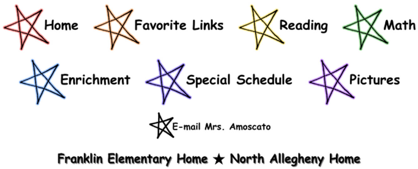
The initial 2006 website was built exclusively in Microsoft FrontPage, a long discontinued “WYSIWYG” (What You See Is What You Get) HTML editor. In these early years, the site was primarily comprised of unoptimized Bitmap Image File (BMP) assets curated in Microsoft Picture It. The focus was on publishing graphical web content with minimal underlying code interactions.
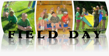
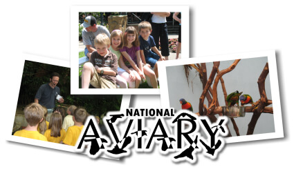
While much of the curriculum content remained static, photos were frequently published, connecting parents to their children’s activities in the classroom. Static HTML photo albums were generated via the jAlbum Java application configured with the popular Chameleon skin. Naturally, a custom graphic served as the entry point to each album.
The first several years culminated in “tribute” slideshows embedded as Windows Media Video files on temporary splash pages. The videos opened with a familiar Star Wars-like “text crawl” before zooming into Google Earth arial imagery of Franklin Elementary School from outer space. The rest of the slideshow showcased photos from throughout the school year backed by popular kids songs.


The Redesign
Having learned more about web development through other projects during high school, the site underwent a complete rebuild in 2010, reflecting a layout that would remain largely unchanged through the present day. The technology stack was comprised of raw HTML and CSS, leveraging PHP includes to centralize header and footer layout partials. Updates were made in Panic’s Coda editor and manually published to a shared server over File Transfer Protocol (FTP). A WordPress blog was deployed in a subpage but did not receive much traction and was later removed.
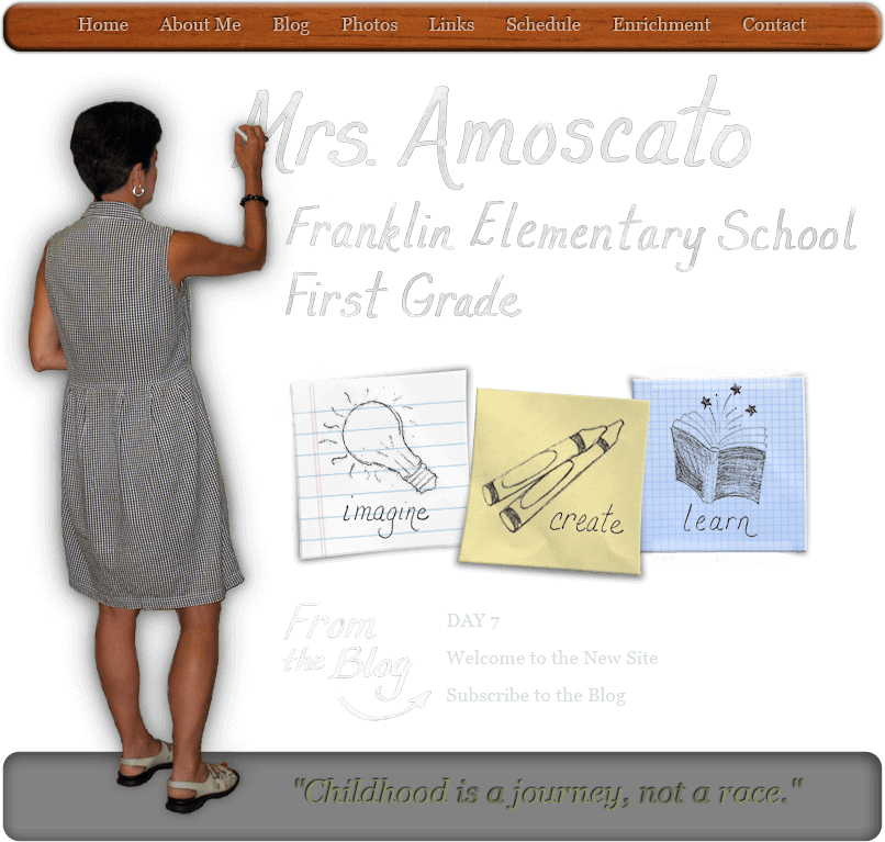
The project still leveraged graphics heavily. The homepage featured a cutout of my mom writing her name and title on a bold green chalkboard graphic that covered the entire site background. In the center of the page, three paper squares featured educational principles adorned with respective hand drawn graphics. Recent blog titles were surfaced at the bottom, and a top wooden bar contained navigation links with a subtle debossed text shadow effect.
The subpage headings were scanned from hand drawn paper and represented digitally as such. The main content was layered on a piece of clipboard paper, extending down the page. Initially, photo albums would continue to be generated via jAlbum, leveraging the more minimal BananAlbum skin. At the time, the web gallery with its tasteful animations were implemented in Adobe Flash.
By 2015, the jAlbum-based photo album generation process over FTP had become unsustainably time consuming. Having used Flickr for personal photography, I adopted the image hosting service as a means to facilitate photo management. This led to implementing one of my first open source projects, an AngularJS-based photo album component that interacted with Flickr APIs. The project also marked my first hands-on experience with TypeScript, a programming language that would quickly become a web community standard. The AngularJS application was embedded into the site via iframe and resembled BananAlbum’s user experience with scrollable thumbnail navigation, keyboard interactions, and rudimentary image preloading. The project would serve classroom photos through the present day.
The Final Project
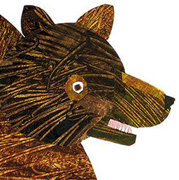
Our family started planning a retirement celebration as soon as we got word mom was officially retiring in December 2023. My sister and wife curated a list of gift and party decoration ideas, many of which were themed from her favorite children authors. Early on in the planning, my sister wrote a rendition of Eric Carle’s “Brown Bear, Brown Bear, What Do You See?” poem, chronicling mom’s life. The last verse was as follows:
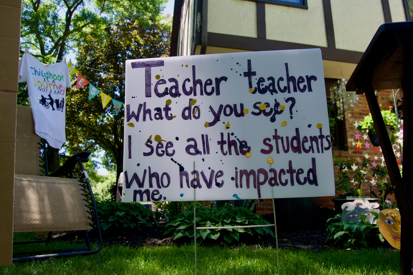
The words were written to caption hand-drawn illustrations on yard signs at the party. They also inspired this website, a “final project” to commemorate my mom’s educational impact.
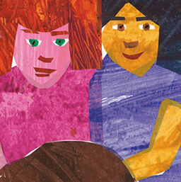
The homepage features a drawing of my mom reading to one of her students. The mural was actually painted shortly after starting her most recent position. It will indefinitely mark the walls of Franklin Elementary School, a place she poured her passion into for two decades.
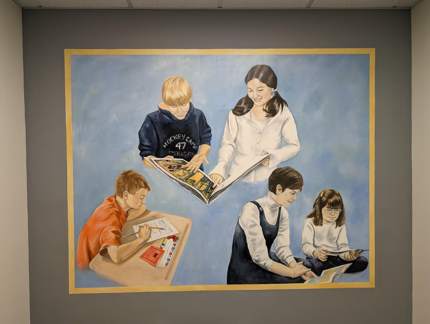
Next to the mural, the question, “Teacher, Teacher, What do you see?” is posed in a bold collage-like font. The typeface, OC Pickllle, is one of the most creative variable fonts I have seen. Inspired by the cut and paste techniques of illustrators Eric Carle and Lois Ehlert, Pickllle seamlessly transitions from an elegant sans serif to a more playful hand rendered design through cutout, jumble, and stagger axes. It introduces contextual cycling to automatically replace repeated characters with alternate forms to render a humanly imperfect appearance.
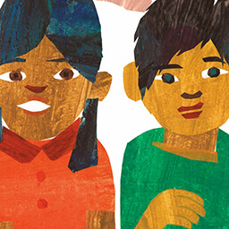
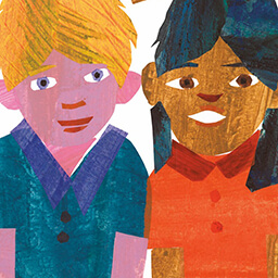
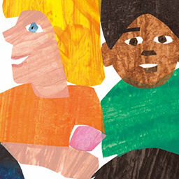
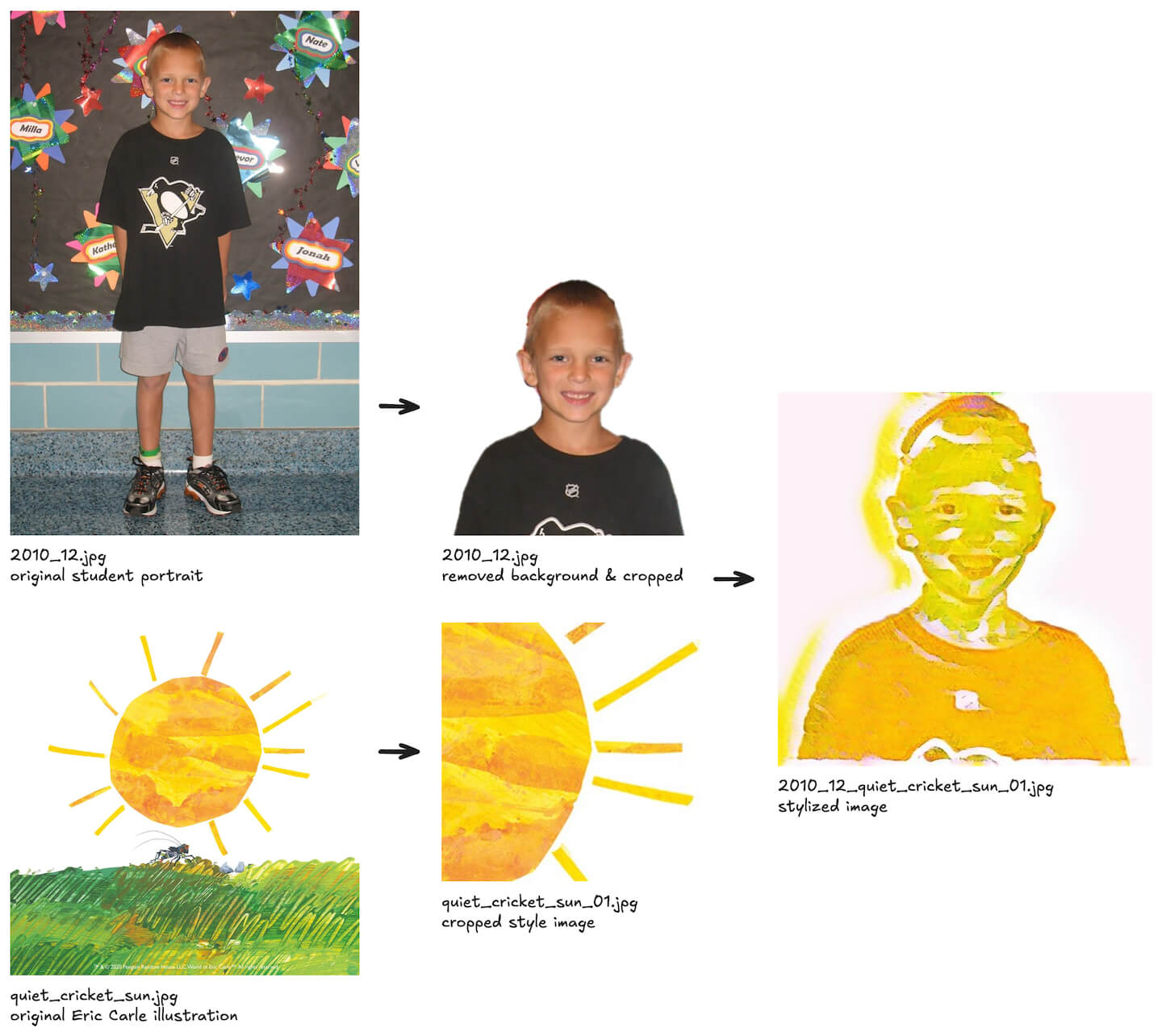
The main attraction of the site is visible slightly above the fold. A colorful grid of student portraits curates a comprehensive yearbook across mom’s 32 years of teaching. Most of the portraits were pulled from an annual “Welcome Friends” photo album taken at the beginning of the school year. Some of the older years (pre-website) were scanned from physical yearbook pages and cropped via Adobe Photoshop’s Crop And Straighten Photos command. The original photos were renamed to follow a year-prefixed convention (i.e. 2010_12.jpg) and optimized via a Node.js script interacting with Tinify APIs.
Next, the photos were batch-processed via a series of Photoshop actions, removing the background, trimming transparency, cropping a top-aligned square (around the head), and resizing. With a handful of manual interventions, this resulted in a new set of relatively uniform 512x512 square portraits on a white background.
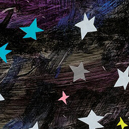
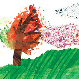
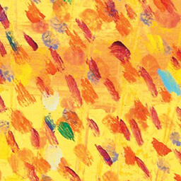
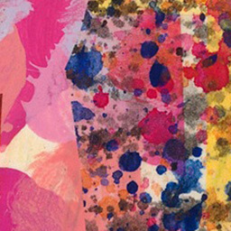
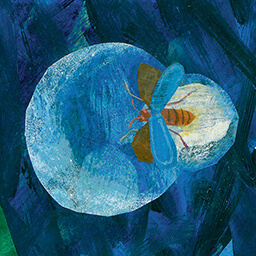
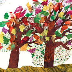
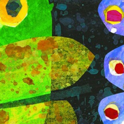
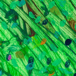
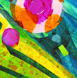
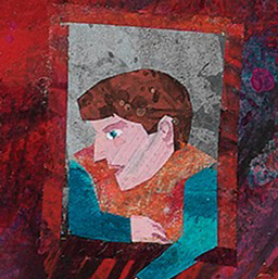
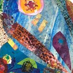
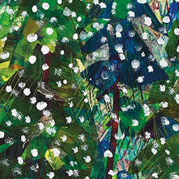
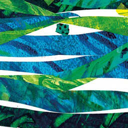
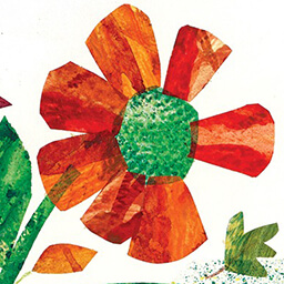
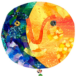
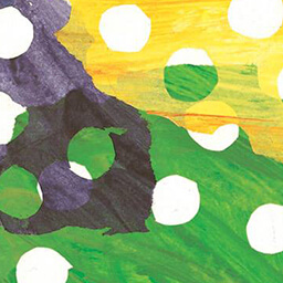
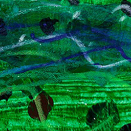
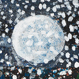
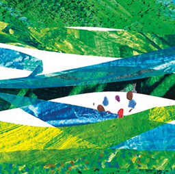
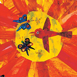
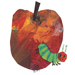
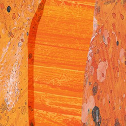
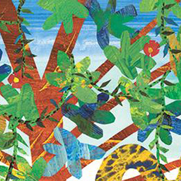
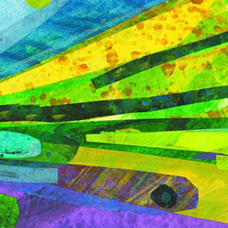
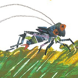
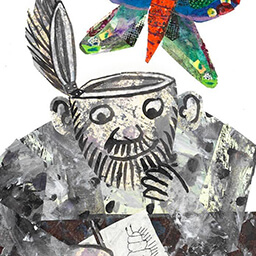
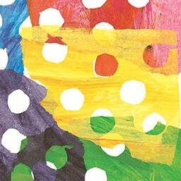
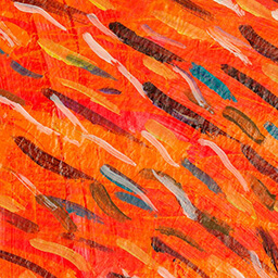
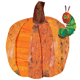
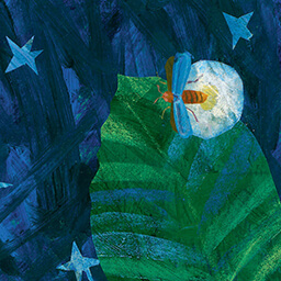
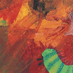
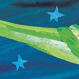
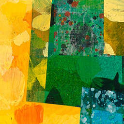
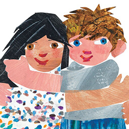
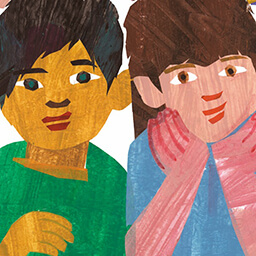
Finally, the portraits were stylized via a Python script based on the Fast Style Transfer for Arbitrary Styles TensorFlow tutorial, leveraging a pre-trained neural artistic stylization network. The style images were cropped from 32 Eric Carle illustrations, each representing a school year in education. After some experimentation, the illustrations ultimately yielded 77 256x256 square “swatches” of simple objects and interesting patterns in a variety of colors. They were explicitly named, with reference back to their original illustration image (i.e. quiet_cricket_sun_01.jpg where the optional numeric suffix differentiates multiple swatches from the same illustration).
The swatches were also optimized via Tinify, randomly ordered, and paired up with the set of square portraits in reverse chronological order. Cycling through the swatches maintain a varied color distribution while scrolling down the page. Ultimately, the stylized image names are a concatenation of the portrait and swatch style (i.e. 2010_12_quiet_cricket_sun_01.jpg).
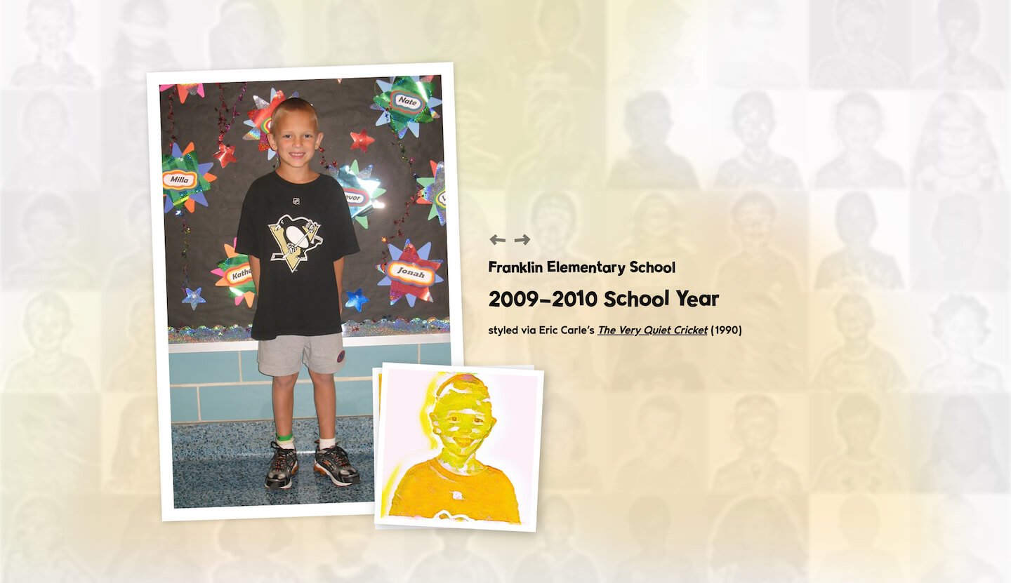
The site is built with Next.js, and the yearbook grid is statically generated at build time by iterating through images on the file system. The stylized image names are parsed and sorted to determine their original portrait, school year, swatch style, and original illustration. Importantly, this metadata is also generated at build time to preemptively surface naming discrepancies (which would otherwise result in runtime errors) and optimize runtime performance.
Clicking on a picture opens a modal featuring the original portrait, stylized image, and caption defined in its static metadata. The stylized portrait also serves as a semi-transparent blurred background accent, and the styled swatch can be toggled into view. Arrow buttons afford navigating through the yearbook, an action also enabled through keyboard shortcuts. A final slideshow feature was leveraged during the retirement celebration to randomly cycle through the student pictures on a television screen.
The Timeline page renders each of the 32 original Eric Carle illustrations in reverse alphabetical order, chronicling mom’s career. Each illustration is captioned with the respective school year and role, similarly derived from static metadata generation.
The Painting page aggregates photos from most recent years in which mom led “Painting like Eric Carle” activities with her First Grade students. The album leverages React Grid Gallery and Yet Another React Lightbox to render a Google Photos-like justified image gallery. The photos were similarly optimized via Tinify and generated statically.
While this page took the least amount of time to build, it is the most meaningful. From jAlbum-generated albums published through Microsoft FrontPage, to an AngularJS application interacting with Flickr APIs, through this statically generated React gallery – displaying such classroom pictures reflects the web’s evolution over the past two decades. In a sense, classroom pictures stimulated the desire for a website back in 2006, and we would end up sharing 20,000 some photos through the years.
